


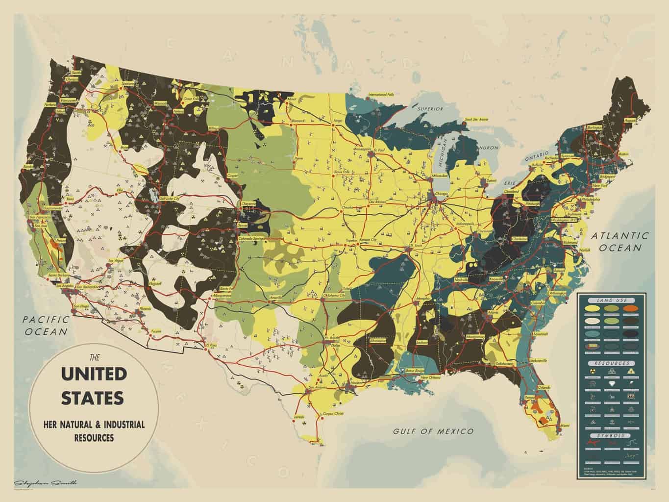
The United States: Her Natural and Industrial Resources
The Inspiration
This map came about when I read Marty's post on MapHugger entitled "The Cartographic Aesthetic." He posited that maps intentionally retain a precise visual language in order to appear authoritative, "rejecting the inclusion of any appearance of human touch" due to it's inherent imperfection.
Included in that post was this beautiful map from the 1940's of Great Britain.

I was enthralled with the style.
I had to replicate it.
For the United States.
The Colors
The palette was
Using Adobe Color I extracted the key colors from the map.
I added a few of my own colors too
The Legend
Now comes the tricky part
Good cartography is 90% data, 5% preparation, and 5% luck.
Data
Prep
Luck
Looking at the legend, I knew that the data would be extra tricky in this case. Not only were some of the terms foreign to me, some were extremely specific.

Where do I find the "Moorland" data for the US? Where are all the food processing plants? Smelting facilities? Cement factories? Is there a map of potteries?
If there was data for all of this, I couldn't find it.
I had to pivot.
The Background
The hunt for data begins.
The original contained data too obscure or specific for me to easily include in my map, so I had to figure out an alternative vision for what my map could be.
I decided to start with the background. The original contains flowy, generalized, land use/land cover data. That's easy enough to reproduce for the United States.

Enter the USDA Cropland data layer
This amazingly rich dataset contains a wealth of information about the land use of the lower 48 United States at 30 meters per pixel. The legend is extensive, containing 125 possible values, from corn to cantaloupes, apples to watermelon, and perennial ice/snow to dense urban.
But how to take advantage of this data? It looks really nice as-is, but the original map had much more general categories and shapes.
Here's how I processed the land use raster into flowy vectors:
- Reclassify
- Reduce and simplify the categories
- Resample
- 30m → 15km by majority rule
- Raster to Polygon
- Smooth Polygon
- Manually stitch together
Before

After

This took some time
Reference Data
This was the easy part
Thanks to NaturalEarth Data, basic background information is extremely easy to come up with. I highly recommend using their data for all your small-scale mapping needs.

Data Mining
Digging for data.
Inspired by the other items in the original legend, I started hunting for relevant datasets that would fall under the "Natural & Industrial Resources" theme. Looking in the "Industries" section, I thought it would probably be possible to find mining related data somewhere.

Prospecting for mining data.
After some searching I came across the United States Geological Survey (USGS) Mineral Resources Data System (MRDS), which is a "collection of reports describing metallic and nonmetallic mineral resources throughout the world."
Perfect. I should be able to find things like granite and cement and iron in there.

That's a lot of dots.
Magnificent Minerals
A rich vein of data
With this dataset I found much more than just granite, cement, and iron. This was a veritable smorgasbord of resource data. Uranium, smectite, shale, exhalite, welded tuff, quartz, pegmatite, gabbro, hornblend, marble...
Reminds me of Dwarf Fortress

To keep things simple, I reduced this gigantic dataset down to a few key categories.

The map still looked massively cluttered, so I used Esri's Cartographic Representation system to Disperse Markers to make them more readable.
When the points were still too numerous, I used a definition query like this:
OBJECTID %5 = 0
The % represents the modulo arithmetic operation, which returns the remainder after a division operation. In this case, the defition query divides
the OBJECTID by 5 and returns the remainder. The result being that only features with OBJECTID's ending in 0 or 5 were displayed, reducing the clutter by 80%.
Artistic License
"Wait, that's cheating"
"You can't just decide to eliminate data from your map because it's too cluttered!"
Yes I can.
It's art.
Other data
There's a lot.
Instead of boring you with the history of every remaining dataset in the map, here's a comprehensive list:
Styles:
- Typeface: Futura
- Symbols:
- Esri Symbol Fonts
- Mapbox Maki
- The Noun Project
- Custom Icons
Software:
- Esri ArcGIS 10.2.1
- Inkscape
Reactions
It made a splash
Publications


Awards
- ESRI User Conference 2014 - Map Gallery
- 2nd Place - Most Unique
- 2nd Place - People's Choice
- AASHTO GIS-T 2014 - Map Gallery
- Best Cartography
- People's Choice
Free download
I'm happy to share this striking, award winning, world famous map with you completely hassle free! Below is a 5K, high definition version for you to download! Just click the image below to get the 5K jpg for your personal use. It's perfect for all your desktop wallpaper needs.
But wait, there's more!
For the first time ever
I'm making a limited number of prints available.


Download the wallpaper
Are you sure you don't want a print?
No?
That's ok, we're still friends. Enjoy your wallpaper!
© Mapsmith 2014