


Mapbox Studio Cartography
Originally published October 15, 2016
I've been playing around with the newest version of Mapbox Studio for a couple of weeks as part of the private beta. I've attempted to put the tool through its paces, to push the cartographic envelope, and now I want to share my thoughts and experiences with you.
In this post, we'll:
- Discuss the history of global mapping.
- Talk about what's new in the latest version of Mapbox Studio
- Go through the first steps in detail to designing a striking map.
- Wrap up with a discussion of the cartographic challenge of designing a global web map.
What is Mapbox Studio?
Mapbox Studio is a web-based mapping application that allows you to quickly style a map of the entire world.
Let's unpack that
That statement is actually pretty freaking amazing, and I don't want you to take it for granted. Simply put, this tool is unique in that it was literally impossible to achieve not that long ago.
When desktop GIS first became a thing, it would have been nearly impossible to have enough computing power and storage space to make such a detailed map of the world. Let alone the fact that a worldwide, digital, street-level dataset probably only existed in the halls of the world intelligence agencies.
Think about how crazy it was in 1996 when Mapquest launched. It was a revolution that you could use the internet to find directions between any two places on the planet. Prior to this, it was the sole domain of the super-powerful internet companies.
When Steve Coast founded OpenStreetMap in 2005, we started to see the first hints of a readily accessible, open, world basemap. Still, not many people had the computing power, bandwith, and expertise to consume such a massive data source.
In 2010, DevelopmentSeed - the company that eventually spawned Mapbox - began development of an open source cartography tool which would allow you to easily style and deploy a web map. It was called Tilemill for the way it allowed you to convert your data into a tiled map easily consumable on the web. It was a refreshing change of pace to expensive GIS or illustration programs for map design, but the data aspect was still as challenging as ever.
The second cartographic tool was initially called Tilemill 2 during development and has now been dubbed Mapbox Studio Classic. Like Tilemill, it used CartoCSS hand-typed into an interactive code window. What made this a great step forward for developing a global basemap was the inclusion of a curated, open data source updated regularly. Without having to download and process OpenStreetMap you could style roads and rivers and buildings all over the world effortlessly.
What's new?
They've been teasing the next release of Mapbox Studio with Tweets of screenshots for a while now, but on July 29th, 2015 they finally made it official on their blog. The main selling point is that the newest version...
will do away with code-based styling and introduce a totally visual interface.
With the transition to a new interface, the entire underlying styling language changed as well. Mapbox GL is a new, open source, JSON-based language specification that combines data source and style definitions in one neat package. In addition to the language change, the coding is gone too. Now a slick user interface helps you design your map.
Now, the entire workflow for making your own, customized map of the entire world is:
- Create an account
- Log in
- Launch Mapbox Studio
- Map
With this perspective in mind, let's make a map.
The Goal:
Develop a map inspired by neon signs.

Making a map
(Note: These screenshots were taken during the beta and may vary slightly from the current version.)
It's pretty simple to get started. Hit the New Style button. This presents you with a list of pre-designed styles for your inspiration. For this map we'll start from scratch. Scroll down and select the Emptyhttps://mapsmith.net//wp-content/uploads/2017/06/ template and click Create.

The blank source
It can be rather daunting to start from the ground up, but if you're wanting to really make something unique, I think it's a must.
![]()
This doesn't look too dissimilar from a traditional GIS program. You launch it, and it sits there - empty - waiting for your data.
Selecting data
Thankfully (and miraculously, as mentioned previously), Mapbox has provided the data for the entire world for you to style (courtesy of OpenStreetMap).
Start by opening the "New Layer" pane. This changes the map view from "Cartography" to "X-Ray" mode, allowing you to see all the data behind the scenes.

You get a preview of the depth and breadth of information available at your fingertips. Click anywhere in the ocean to select the water data and then hit "Select."

Once a layer has been selected, the data is highlighted in the map. This will be especially helpful later when filters are required.

water layer it becomes highlighted on the map and the rest of the data gets greyed out.Go ahead and press "Create Layer" and the map switches back to Style mode.
Styling data
Now we get our first look at the map styling tools. Also, we can breathe a slight sigh of relief that our map is no longer blank.

Let's see what we have to work with.

Let's break down our toolbox.
- Color pickerRGBA and HSVA modes available.
- Pattern PickerSymbols used for POI and icon fills.
- Opacity SliderFrom 0 (fully transparent) to 1 (fully opaque).
- Antialias ToggleAntialias in this context is a 1px outline of a polygon. When you hover over a style tool in the application it shows you a handy descriptive popup.
- Antialias Color PickerSame color picker as above, except for the antialias color.
- Translation SettingsIf you want to have your style visually translated from it's location.


That's a pretty standard set of tools, not a lot of mind-blowing stuff in the polygon styling toolbelt...
Oh, except did I mention...? Everything you do changes live?
Click on the GIF below to check out the color picker in action.

The live updating ocean color is made possible by the amazing technology Mapbox uses to render the map in your browser. Basically, it uses your graphics card to continuously render the map at 60 frames per second. This allows for the cartographer to get instant feedback on their design. For more information about the underlying technology, head over to the Mapbox blog.
Building the Style
Let's start building the map. We've got the water layer added to our map, let's set the color.
Water
Use the color picker to set the fill color to #246.
Land
One important thing to note when creating your map is that of your underlying background data layers (water and land), only the water is actual data. You style the land by styling the background of the map (i.e. the absence of water). To add color to the land, click the Background layer and set it to color #1F1A1D.

Countries
Let's add the country boundaries. This will give us a chance to highlight the built-in query tools. Create a new layer, click Select a Dataset, and then select the admin layer from the list.

When you select the admin layer, you get the entire unfiltered dataset. I want to style only the land country boundaries, so I click the add filter button towards the bottom of the pane to see what attributes can be queried.

Use the following settings to query out only the level 2, undisputed, land (non-maritime) boundaries (see above animation).
admin_level is 2maritime is 0disputed is 0
Then click Create Layer. Let's look at the ways we can style lines.

This is a pretty standard set of line styling options. There are a couple of options worth noting though. The gap width option is nice for allowing you to have "casing" for your roads or paths for example.

gap width settings.This is great for road casing. It gives a slight visual separation to the roads. (via Mapbox Streets style)
The blur setting is an interesting one that we'll check out next.
Styling
On the admin layer, let's give our country boundaries the following settings:
color: | #EF0 | |
dasharray: | dash: 1, | gap: 2 |

That's nice, but it stays at width: 1px no matter how much you zoom in. Let's make the line width vary with zoom level.
Styling by zoom level
Since Mapbox GL allows floating point zoom levels (versus integer zoom levels in CartoCSS), hard-coding styles to specific zoom levels doesn't make much sense any more. Now a function defines the way your style changes as you zoom. This allows you to very quickly setup complex rules for your styles.
Click the button to the far right side of the line width setting to open up the style by zoom level dialog box.

After it pops out, click "Enable styling by zoom level."
At zoom level 0, set the line width to 0.5 px. At zoom level 22, set the line width to 10 as shown in the screenshot below.

z0 to z22.So our yellow dashed country boundaries are nice looking, but let's kick'em up a notch!.
Layering layers
My biggest complaint with migrating away from CartoCSS to Mapbox GL is the fact that the same data layer can't hold multiple styles. This means that for each layer style (casing, fill, glow, etc.) you'll need another layer.
For this map, that means we're ultimately going to end up with over 100 layers.
So, let's get started.
Start by duplicating the existing admin layer with the button at the top of the table of contents.

We're going to create a neon light-like glowing effect, so below the bright yellow #EF0 color we'll put a darker color. We'll also make it wider and utilize the blur function. Edit the admin copy layer to include the settings below.
color: | #AB0 | |
width: | [0,0.5 | |
blur: | [0,0 | |
dasharray: | dash: 1, | gap: 0 |
dasharray setting by changing the gap to zero.Since we'll eventually have hundreds of layers it is a good practice to start setting sensible names to your layers from the start. With the admin copy layer selected, click on the name at the top and type in admin-med.

admin copy layer to something like admin mediumThat will create a pretty nice effect, but we're not done yet. Let's do it one more time with an even darker yellow and an even wider stroke and larger blur. Duplicate the admin copy layer and apply the following settings.
color: | #660 |
width: | [0,5 |
blur: | [0,10 |
Notice that the zoom level scales don't have to be a consistient ramp from z0 to z22. In this case I ramp them up quickly so that by time the user gets to z10 the admin lines are at their widest.
I do this to manage the "visual importance" of the country boundaries. As you get closer in and cities and highways start showing up, admin borders become less important compared to roads and rivers.
Before we move on from the admin layers, we need to rearrange them. If you followed the steps above, then your layers will probably be arranged backwards. Just click and drag the layers the rearrange.

So our country boundaries will end up looking something like this:

Now you're probably starting to piece together why there will be over 100 levels. If we want a glowing effect on all the lines, then we're going to have to duplicate each line several times.
So here's our world map with yellow dashed neon country borders.

And here it is a little closer:

Next I'm going to add admin level 4 (states) in a similar style, but purple and a little thinner than the country borders.

Water
Those Swiss lakes look a little dull, let's make them glow!
Now we'll do something just a little tricky. We're going to take the water layer - which is a polygon dataset - and add it to our table of contents as a line layer.
In the New Layer view, select the water dataset, and then at the bottom change the type from fill to line.

water layer as a line instead of a fill.This new layer will automatically appear at the top of your table of contents, but we don't necessarily want it there. To rearrange, simply click and drag on the layer!

Nice.

Basic Labels
Let's give our map readers some context as they're zooming in on our map by adding country labels.
Start by creating a new layer using the country_label layer.

country_label data layer and flitering by type = 'country'.Be sure to change the type of layer at the bottom to Symbol.
Mapbox has generously teamed up with FontFont to provide a very nice assortment of professional fonts for your map design pleasure. Let's pick one that's angular and technical looking so that it matches our neon theme. I opted to go with Magda Clean Mono Offc Pro Black.
Let's style those labels.

Another thing we want to do is have state labels show up at some point as you zoom in. For this we'll use the zoom-extent setting in the new layer window.

state_label data layer and set the min zoom extent to 4.Highways
Alright, this post is getting really long, so we'll skip ahead to the really neat part - neon roads.
Start by creating a new layer using the road dataset with a filter of class = 'motorway'.

roads layer with class = 'motorway'.To create a glowing neon effect, we're actually going to stack three different layers of the same data using different styles. Remember how we stacked up several layers to making the glowing country borders earlier? We'll do the same thing here for the highways.
The result with look something like this.

Let's get started. First let's make the thin top layer. It is a thin, yellowish, slightly blurry line.

Next, duplicate the layer, make it a little orange-er, a little wider, and a little blurrier.

Next, duplicate the layer again, make it a little orange-er, a little wider, and a little blurrier.

Let's see how that looks as we zoom in.

I've added lower level streets just for reference. Also, there are gaps between different segments because the road dataset doesn't include bridges. To get those to show up you need to duplicate the layers and change the data source to the bridge dataset.
Explore the Final Product
Here is the completed map.

As of 10/13/15 parts of the map are still being designed.
Wrap-up
It takes a lot of work to develop a cohesive, comprehensive well-designed web map of the world. Based on the responses to Saman Bemel Benrud's question from the other day, some cartographic heavyweights like Jonah Adkins and Bill Morris put the number at 1-4 work weeks.

Subsequent discussion in The Spatial Community Slack seemed to concur. Good cartography takes time!
It's a farily new thing for everyday cartographers to have the tools to be able to easily design a global, zoomable map. This requires a new set of skills:
- Designing across zoom levels
- Designing data you don't have complete control over
- Designing across cultures
- Designing for both dense and sparse areas
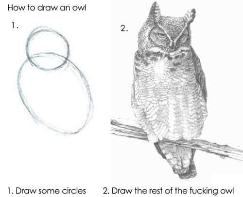
I started this post intending to write a comprehensive guide to designing an awesome map with the new Mapbox Studio, but now I'm really concerned that I've only given you sufficient instruction for drawing some circles, and I'm leaving it up to you to figure out how to draw the rest of the f$#%ing owl.
Maybe someday I'll record a screencast or make a video about designing a global basemap. Would you watch something like that?
If you found this useful at all, I'd really appreicate hearing from you. If there was something I could have done to make this better, I'd really like to hear about it!
Seriously, I love getting your emails!