June 16, 2018 - Comments Off on Flight Data Visualization
Flight Data Visualization
I've always wanted to use aircraft flight paths for data visualization because it is an interesting, relatable dataset which also has an organic quality to it. The data is also very big and hard to come by, which would present a technical challenge for me to consume and visualize.
I decided to start by trying to determine the pattern of how airplanes fly around my hometown of Burlington, Vermont.
Pre-flight Checklist
First, I turned to FlightRadar24 to try to parse their flight data. I reverse engineered their API by watching network traffic on each page. After creating a scraping script in development, the API blocked me when I tried to scrape too much data too quickly.
To see the development process, check out my Twitter thread from March 2018.

The final code can be found on this Gist.

Screenshot of the Gist
Changing Direction
Since I could no longer hit the FlightRadar24 API, I looked for alternative sources of data. I found FlightAware which had very cheap rates. Paying a less than a penny per API call removed the risk of being blocked for hitting a rate limit.
Since the API was totally different, it required a new pattern of API calls to achieve the same results.
I used the change in API to change the purpose of my data exploration. I've always wondered what I'm looking at on the ground when I get a window seat on a flight. Instead of doing a mass data visualization, I decided to switch to an "App" like experience that simulated a flight path. I built it using Electron and fully version controlled the project on GitHub.

App screenshot
You can follow most of the development (with GIFs!) on this Twitter thread.

Twitter Thread #2
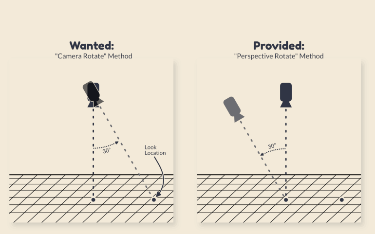
I made a lot of progress, and I had a lot of fun, but I ran into some dead ends. I built the initial prototype using historic flight paths, and I was loathe to refactor it to support future flights. The nail in the coffin, however, was the approach web mapping tools take to viewing angles.
For the app, I wanted a "point of view" angle, where the camera would be centered at the latitude and longitude and altitude of the actual flight. Unfortunately, web mapping libraries take a different approach. They instead take a fixed location on the ground, and move the camera to an angle around it.
A Final Approach
Some time later I noticed the great data vizzer (with a great name!) Topi Tjukanov was messing with flight data as well from a service I hadn't discovered in my Googling.

Topi's Tweet
I was excited to discover ADSBexchange.com provided a live feed, as well as a queryable URL. I worked for a while on fetching data with URL query strings, but ran into rate limits again because they didn't build that endpoint for scraping.
In the end, I settled for downloading their daily 10GB archive of 1,440 JSON files, each representing 60 seconds worth of worldwide flight traffic. I eliminated the need for API calls, trading that for processing mountains of text files instead.
Prepare for Landing
I can now create a single GeoJSON of every flight in the dataset that intersects a bounding box. Each line segment represents 60 seconds of a flight, and includes a few attributes to allow for different data visualization.
Flight Log
(How It Works)
I start by getting a list of all files in the daily dump folder. Then I begin the main loop by going through each file one at a time. I bring each file into memory as a JSON object and then filter out the flights that are not within the bounding box. The remaining flights are hand-crafted into a valid GeoJSON object. Each Feature gets attributes assigned to it along with an empty array of coordinates.
To populate each Feature coordinates array, I loop through the coordinates in the source file and push each [longitude, latitude] pair. To ensure each LineString is valid, I verify that at least two pairs were added to the coordinates array.
After doing that process for 1,440 files and thousands of flights, I create a ReadableStream and .push() the final GeoJSON object into it. Afterwards, I .pipe() that Read stream into a Write stream. I don't know if this is the best pattern, but it's the best I could scrape (heh) together based on the StackOverflow and blog articles I came across for writing large files with Node.js.
For a 2x3° bounding box, the final file output is about 300MB.
Here is the resulting script:

The script
Flight Planning
I already have a few other areas that I want to explore.
- Filter based on Origin or Destination airport instead of bounding box
- Programmatically export an image with MapShaper
- Combine multiple days
- Separate commercial, military, and general aviation flights
- Visualize with a 3D library
- Make an animation
- Output to a database rather than GeoJSON
Data Visualization
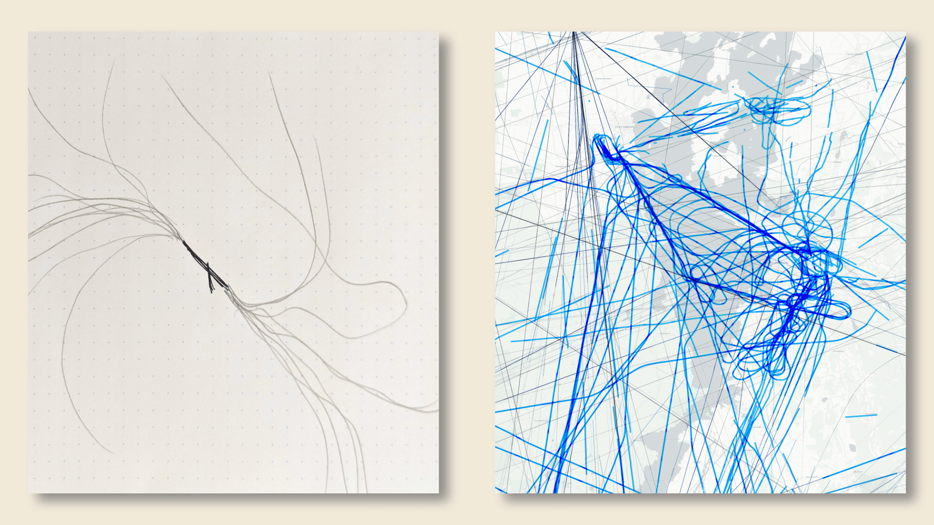
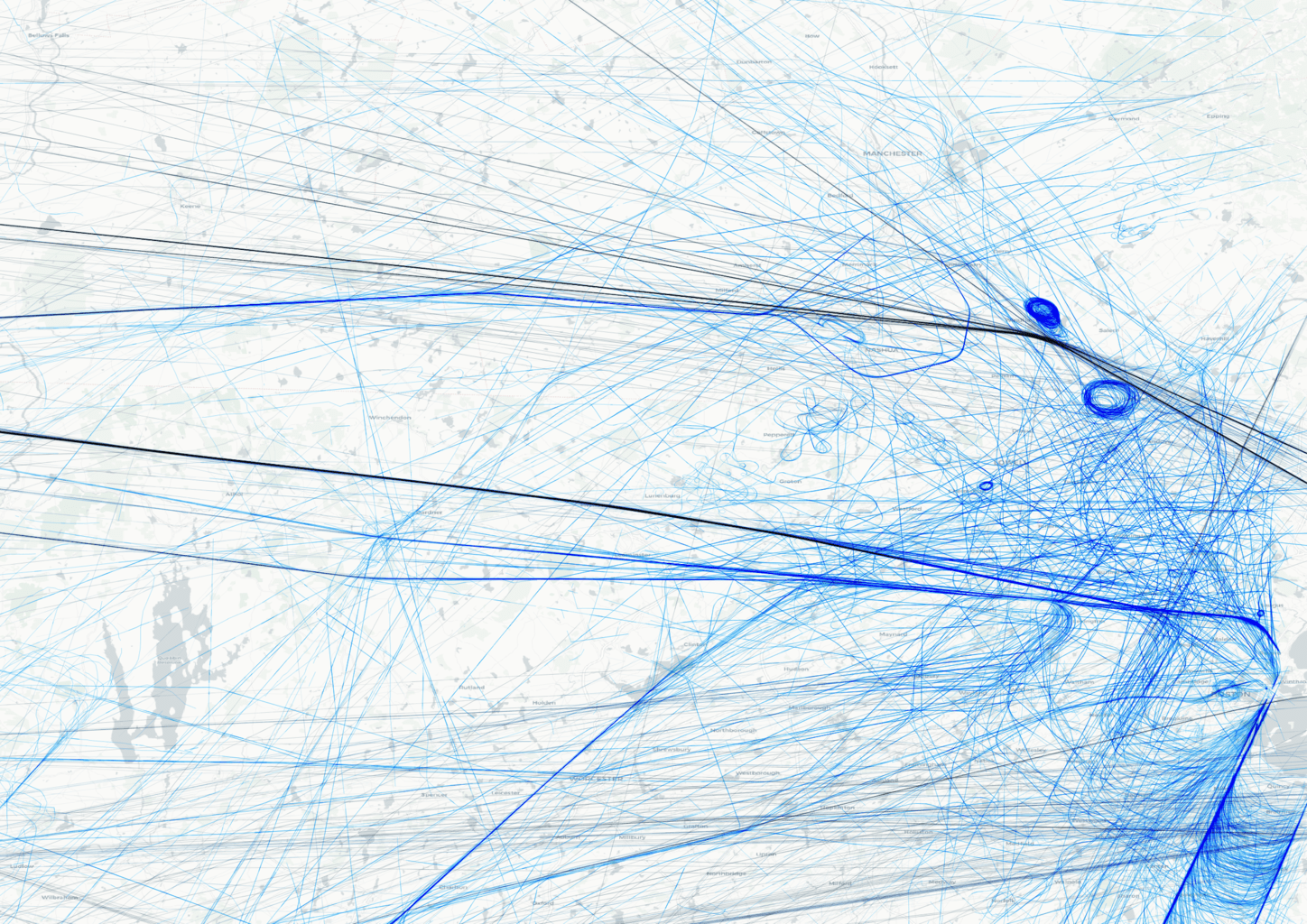
Here are some cool renders from the data.
Boston area flights (6MB PNG)

Burlington area flights (7MB PNG)
More Data Visualization
Interested in other big data visualizations I developed in tweet threads? Check out this recent project to represent land use with simple icons.

Comments are closed.